
The process began with comprehensive research into Solana's existing brand guidelines, the landscape of blockchain education, and current trends in educational technology branding. We also conducted interviews with key stakeholders from Solana and prospective SolanaU participants to gain a thorough understanding of their vision and expectations.
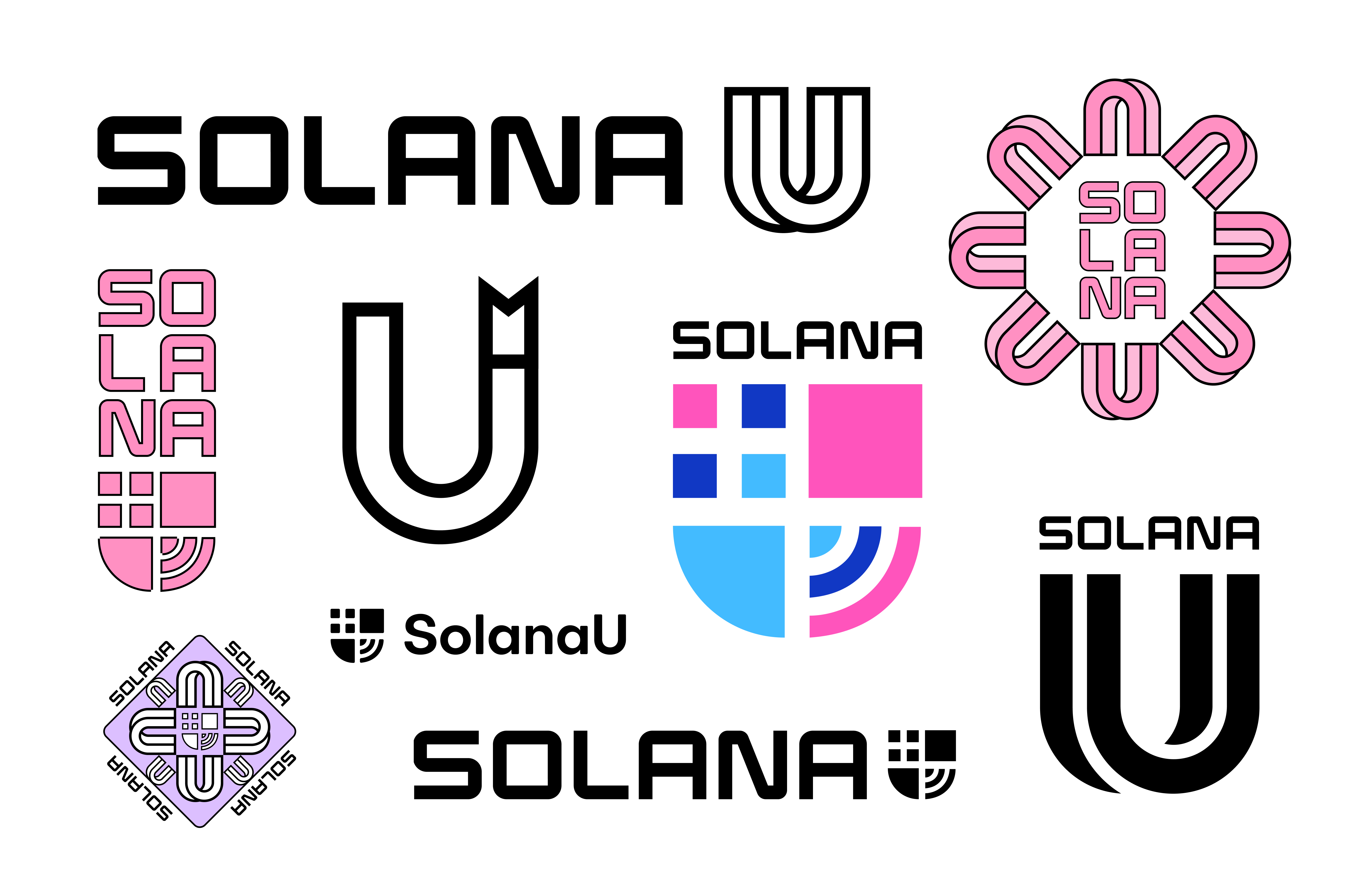
Based on this research, we developed several conceptual directions that explored various approaches to integrate Solana's technological strength with academic tradition. This included experimentation with diverse color palettes, typography, and iconography capable of representing both blockchain concepts and educational themes.
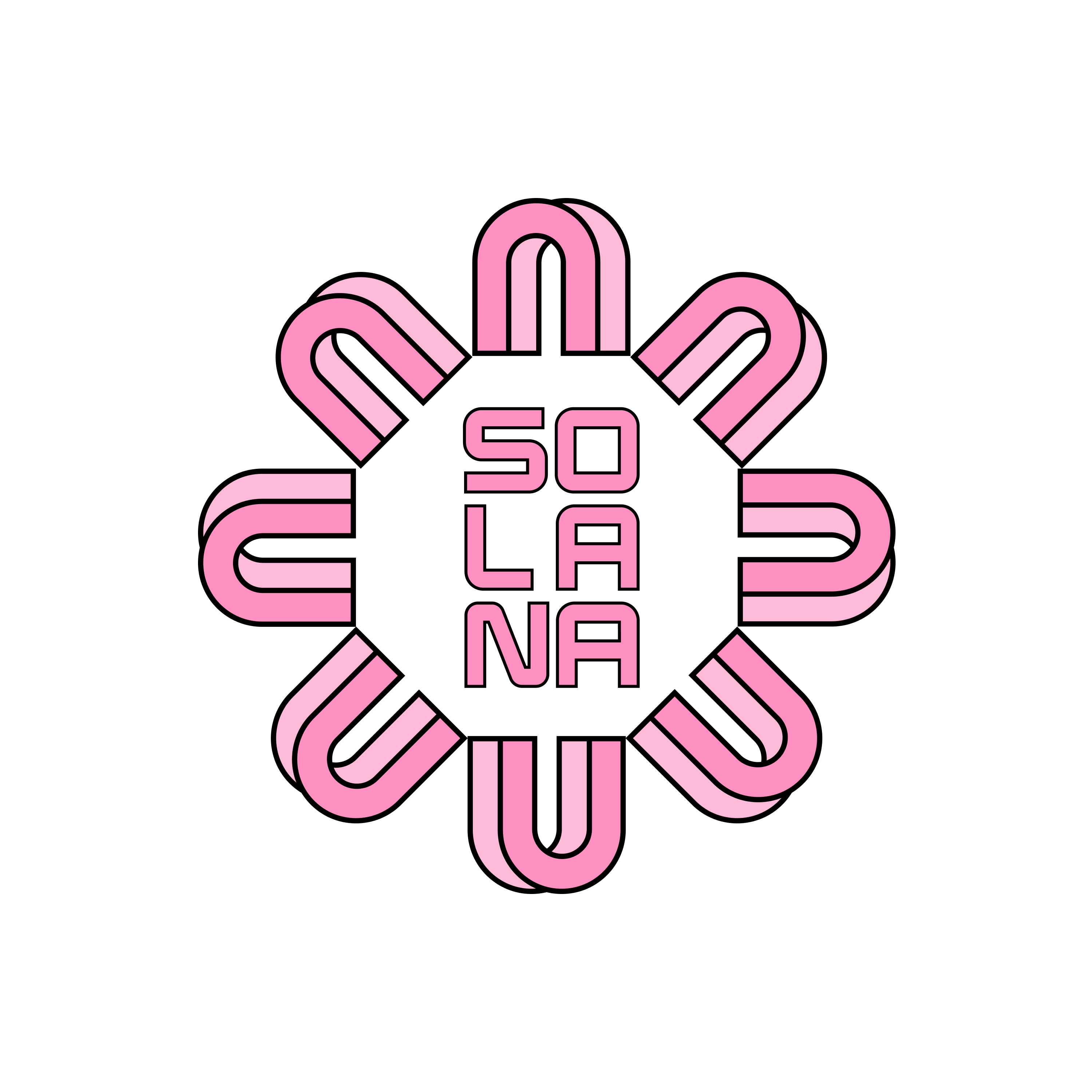
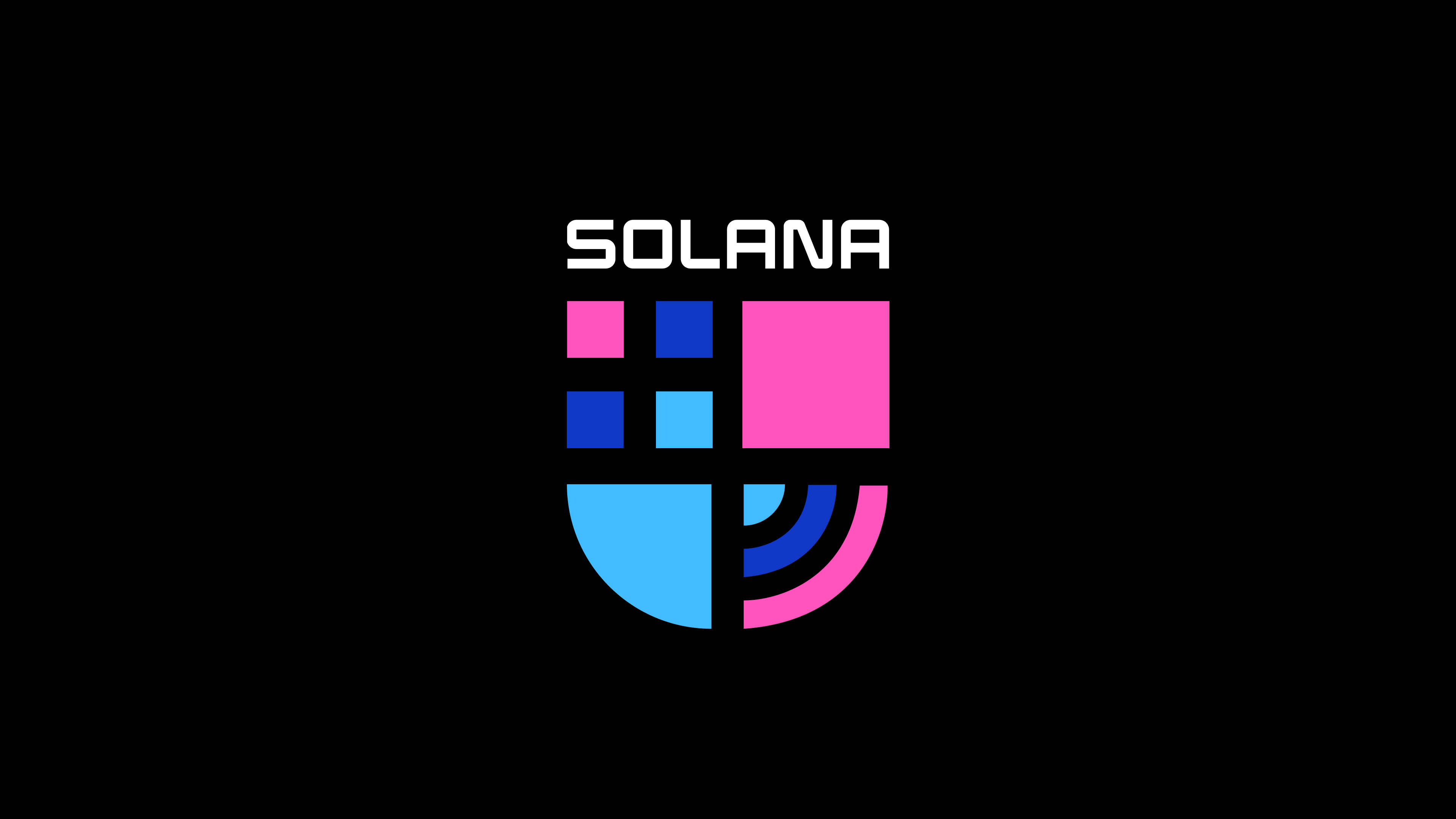

Through iterative feedback and refinement, we converged on a design direction that resonated with both Solana's team and the target audience. The focus was on establishing a versatile system adaptable to a range of applications, from digital platforms to physical marketing materials.
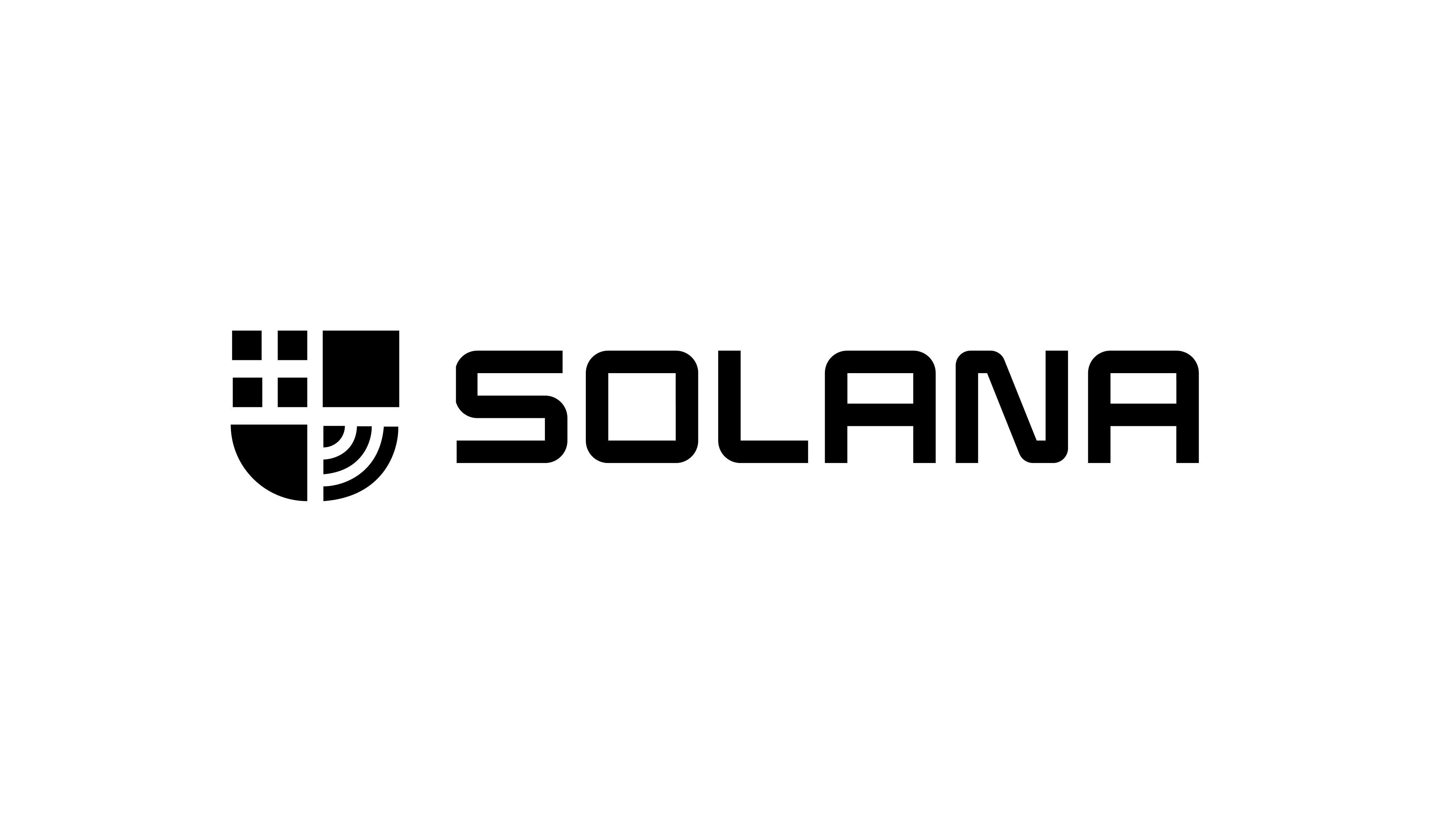
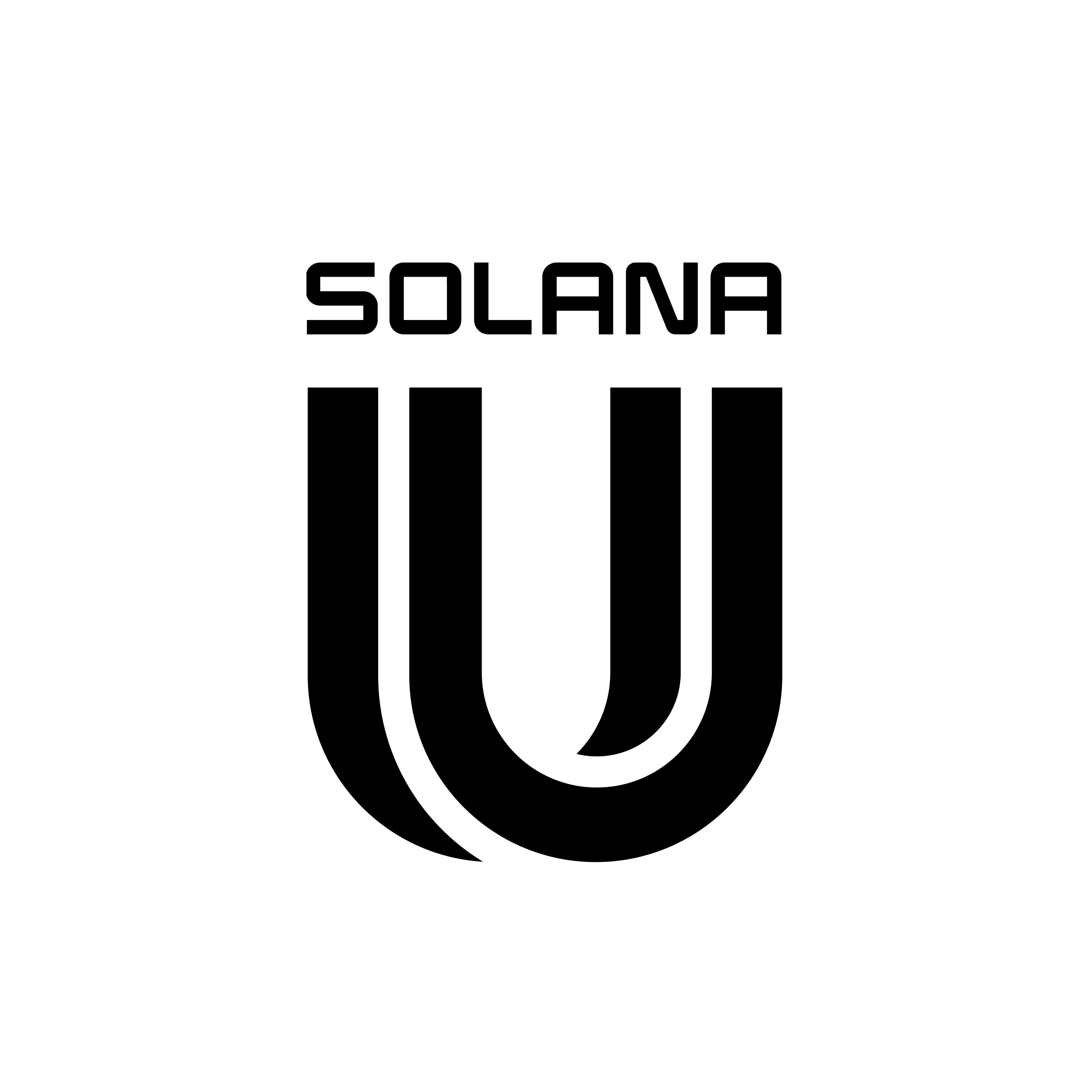
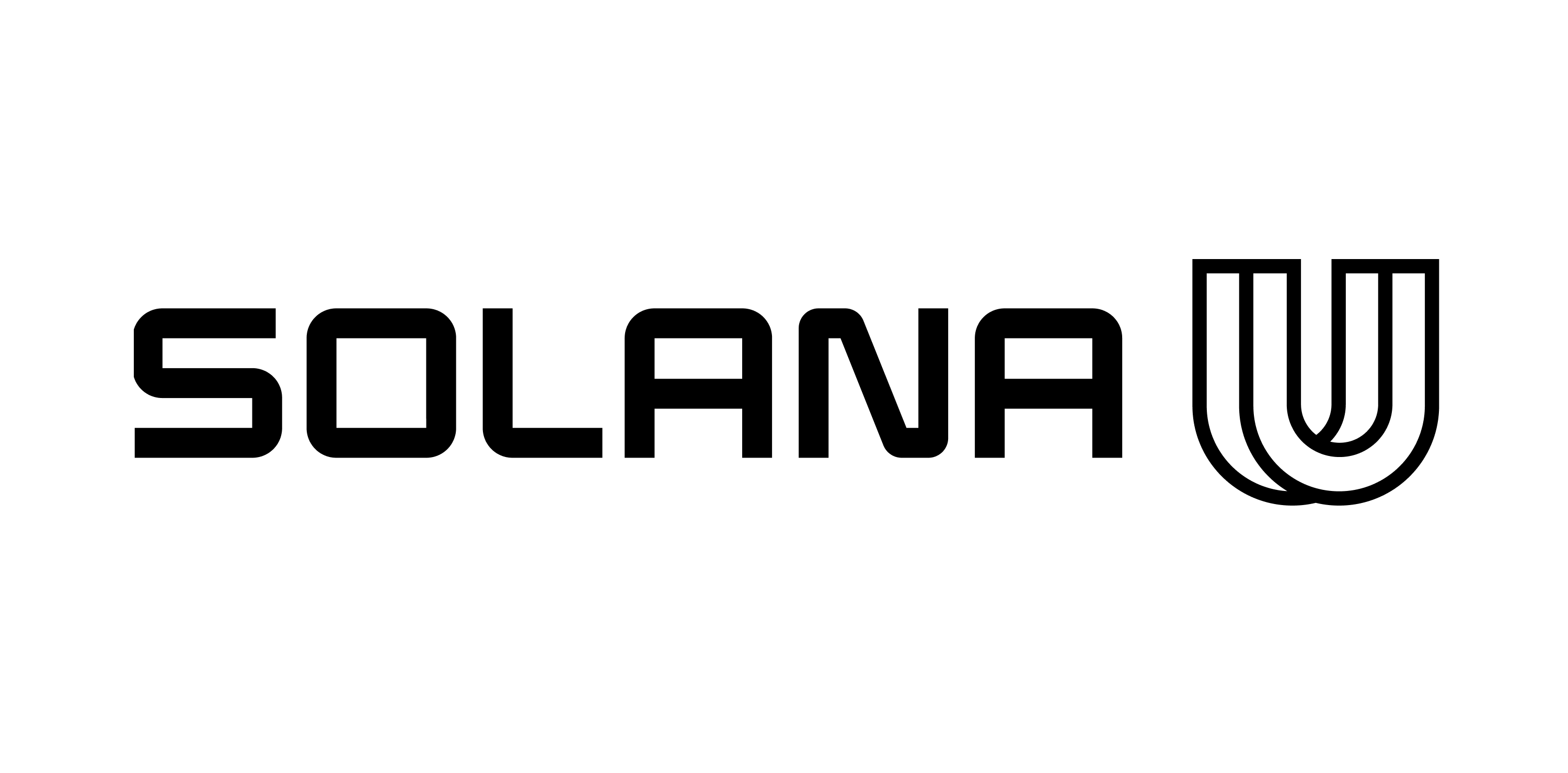
The chosen identity features a minimalist black and white palette, strategically utilizing both negative and positive space. This is exemplified by the reversible U mark, a custom letterform designed to be used in both filled and outlined versions depending on the context and desired style.
Overall, we found it a privilege to collaborate with a company we greatly admire. The process of crafting a symbol of personal growth and education within the blockchain community was a rewarding experience. We look forward to witnessing the continued growth and educational impact of SolanaU in the future.